
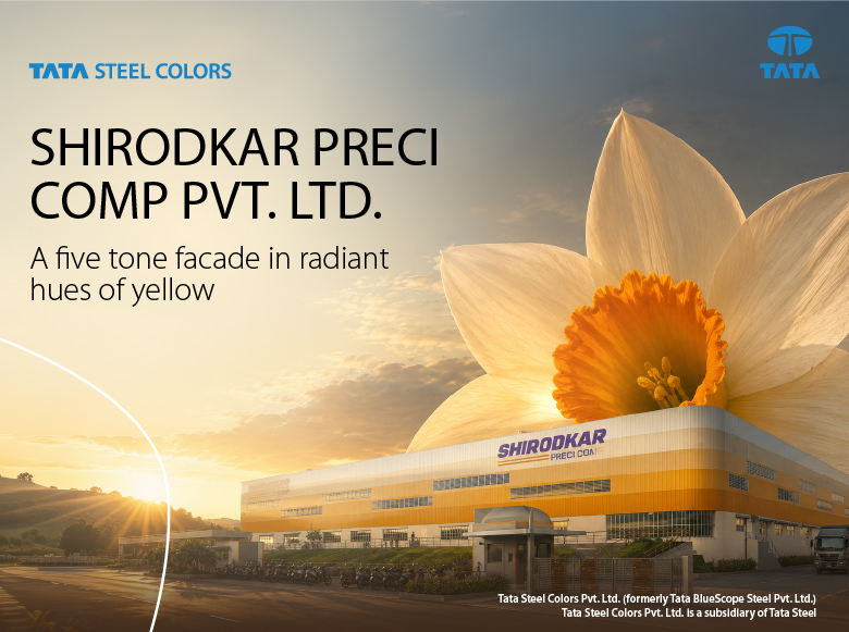
Shirodkar Preci Comp Pvt. Ltd.
There are visions that often arrive fully formed. Bold, specific and completely clear in the mind of the person holding them.
Then the job of everyone around in fulfilling that vision is simple in theory, yet enormously demanding in practice.
The story of Shirodkar Preci Comp Pvt. Ltd. is one of those. Shirodkar is not a company that thinks small. Trusted by over 30 of the world’s most demanding companies across aerospace, oil and gas and flow control, precision is not just their craft, it is their character. So when they set out to build their new 16,000 square metre greenfield facility in Dindori MIDC, Nashik, they brought that same uncompromising standard to a question most industrial developers never think to ask. What should this building say about who we are?
Working with their architect, Shirodkar arrived at an answer that was as audacious as it was specific. Five custom colour shades, each a radiant expression inspired by the sun, flowing across the entire facade in a carefully imagined sequence. From the warmth of Daffodil Yellow to the refinement of Oyster White, every shade had been thought through, named and imagined with intention.
This was not a colour palette. It was a statement about identity, about pride, about the belief that a warehouse in an industrial estate deserved to be as considered and as beautiful as the brand it housed.
It was a breakthrough idea for Indian industrial architecture. And it needed hands that could bring it to life without losing a single drop of its ambition.
That is where Tata Steel Colors came in.
When the brief reached us at Tata Steel Colors, we understood immediately what was at stake. This was not simply a colour coated roofing and wall cladding requirement. This was an architectural vision that lived or died on our ability to deliver five very specific shades in colour coated coils, exactly as imagined.
Not approximately. Not close enough. Exactly.
Some of the shades required fresh development from the ground up. In manufacturing, developing a new colour is not a small undertaking. Each new shade demanded a minimum production run of 22 tonnes, a quantity we had to plan, account for and deploy with surgical precision across every plane of roofing and wall cladding.
Not a coil wasted, not a metre misplaced.
The process that followed was meticulous and unrelenting. Five shades responding differently to light at different times of day, across horizontal roof surfaces and vertical wall planes, across seasons and temperatures, every variable had to be tested, refined and resolved before we were satisfied.
Working closely with Archivista Engineering Projects Pvt. Ltd., architecture partner on the project, we ensured that every detail of the vision translated from blueprint to building without compromise.
There were no shortcuts. Because shortcuts would have meant letting the vision down. And that was never something we were willing to do.
When the facility finally rose in Nashik, it did not just quietly open its doors.
It made an entrance.
For Indian warehousing and industrial architecture, this was truly unique. A five tone colour coated roofing and wall cladding solution built entirely around an architect’s vision had never been attempted in this segment before.
It changed the conversation about what industrial buildings could aspire to be. And it said something we are proud of about who we are at Tata Steel Colors.
We do not stunt a vision. We build up to it, however demanding, however unprecedented, however exact the ask.
Behind this building is the story of a vision that refused to be diluted. And a team that refused to dilute it.